Introduction: Rethinking Your Kitchen Peninsula
The kitchen is often hailed as the heart of the home, a bustling hub of activity where meals are prepared, memories are made, and conversations flow. Within this vital space, the kitchen peninsula stands as a versatile feature, offering additional countertop space, seating, and storage. While many homeowners opt for a uniform design throughout their kitchen, introducing a differently colored peninsula can inject personality, create visual interest, and define distinct zones within the room. This article delves into the myriad benefits of painting your kitchen peninsula a different color than the main kitchen, exploring design considerations, color psychology, practical implications, and tips for successful implementation.
The Allure of a Contrasting Peninsula: Why Choose a Different Color?
Choosing a different color for your kitchen peninsula is more than just a cosmetic decision; it’s a strategic design choice that can significantly impact the overall aesthetic and functionality of your kitchen. Here’s a breakdown of the key advantages:
1. Visual Interest and Focal Point
A contrasting peninsula immediately draws the eye, creating a focal point that breaks up the monotony of a uniformly colored kitchen. This is particularly effective in larger kitchens where a single color scheme can feel overwhelming or impersonal. By using a bolder or more vibrant color on the peninsula, you can add a touch of drama and sophistication to the space.
2. Defining Zones and Spaces
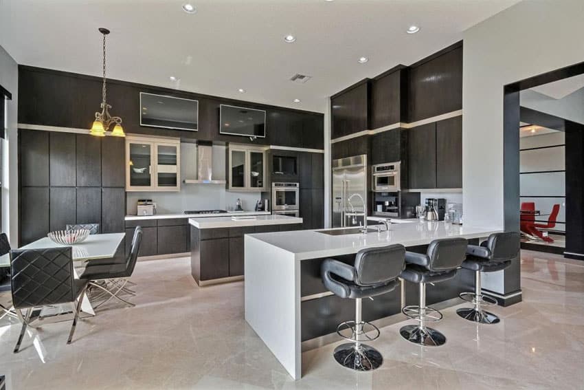
Open-plan living is increasingly popular, but it can sometimes lead to a lack of definition between different areas. A differently colored peninsula can act as a visual divider, subtly delineating the kitchen from the dining or living area. This is especially useful in smaller spaces where clear boundaries are essential for creating a sense of order and functionality.
3. Highlighting Architectural Features
If your kitchen peninsula boasts unique architectural features, such as custom cabinetry, intricate moldings, or a striking countertop, painting it a different color can help to highlight these details. A contrasting color will draw attention to the peninsula’s design, making it a standout feature in the room.
4. Expressing Personal Style
Your kitchen should reflect your personal taste and style. A differently colored peninsula provides an opportunity to express your individuality and create a kitchen that is truly unique. Whether you prefer bold and vibrant hues or subtle and sophisticated shades, the peninsula can serve as a canvas for your creativity.
5. Enhancing the Overall Aesthetic
A well-chosen contrasting color can enhance the overall aesthetic of your kitchen, adding depth, dimension, and visual appeal. By carefully considering the existing color scheme and the desired mood, you can create a cohesive and harmonious design that is both stylish and functional.
Design Considerations: Planning Your Contrasting Peninsula
Before you rush to grab a paintbrush, it’s essential to carefully consider several design factors to ensure a successful and visually appealing outcome. Here are some key considerations:
1. Existing Color Scheme
The most important factor is the existing color scheme of your kitchen. The color you choose for the peninsula should complement the colors of your cabinets, countertops, backsplash, and flooring. Consider using a color wheel to identify complementary colors or analogous colors that create a harmonious and balanced look. For example, if your kitchen features cool gray cabinets, you might consider a warm wood tone or a soft blue for the peninsula.
2. Kitchen Size and Layout
The size and layout of your kitchen will also influence your color choices. In smaller kitchens, it’s generally best to avoid dark or overly bold colors, as they can make the space feel cramped and enclosed. Lighter colors, on the other hand, can create a sense of openness and airiness. In larger kitchens, you have more freedom to experiment with bolder colors and contrasting shades.
3. Natural Light
The amount of natural light in your kitchen is another important consideration. Natural light can affect the way colors appear, so it’s essential to test your chosen color in different lighting conditions before committing to it. Colors tend to appear warmer in natural light and cooler in artificial light. If your kitchen receives a lot of natural light, you can afford to use cooler colors on the peninsula. If your kitchen is darker, warmer colors will help to brighten the space.
4. Style of Your Kitchen
The style of your kitchen should also inform your color choices. In a traditional kitchen, you might opt for classic colors like cream, white, or navy blue. In a modern kitchen, you might choose bolder colors like black, gray, or even a pop of bright color like red or yellow. Consider the overall style of your kitchen and choose a color that complements the existing aesthetic.
5. Countertop and Backsplash
The color of your countertop and backsplash should also be taken into consideration. Choose a color for the peninsula that complements these existing features. If you have a patterned countertop or backsplash, you might consider choosing a solid color for the peninsula to avoid overwhelming the space. If you have a solid countertop and backsplash, you can experiment with more patterned or textured finishes on the peninsula.
Color Psychology: Choosing the Right Hue for Your Kitchen
Color psychology plays a significant role in how we perceive and experience a space. The color you choose for your kitchen peninsula can influence the mood and atmosphere of the room. Here’s a brief overview of the psychology behind some popular kitchen colors:
1. White
White is a classic and versatile color that is often associated with cleanliness, purity, and simplicity. A white peninsula can create a sense of openness and airiness in the kitchen, making it feel larger and brighter. White is also a neutral color that pairs well with almost any other color.
2. Gray
Gray is a sophisticated and modern color that is often associated with neutrality, balance, and sophistication. A gray peninsula can add a touch of elegance to the kitchen, creating a calm and relaxing atmosphere. Gray is also a versatile color that can be paired with a wide range of other colors.
3. Blue
Blue is a calming and serene color that is often associated with peace, tranquility, and stability. A blue peninsula can create a relaxing and inviting atmosphere in the kitchen, making it a perfect place to unwind and enjoy a meal. Blue is also a versatile color that can be paired with a variety of other colors, from warm neutrals to vibrant accents.
4. Green
Green is a refreshing and natural color that is often associated with growth, harmony, and nature. A green peninsula can bring a touch of the outdoors into the kitchen, creating a vibrant and energizing atmosphere. Green is also a versatile color that can be paired with a wide range of other colors, from earthy browns to bright yellows.
5. Yellow
Yellow is a cheerful and optimistic color that is often associated with happiness, energy, and creativity. A yellow peninsula can brighten up the kitchen, creating a warm and inviting atmosphere. Yellow is also a versatile color that can be paired with a variety of other colors, from cool blues to warm oranges.
6. Red
Red is a bold and energetic color that is often associated with passion, excitement, and power. A red peninsula can add a touch of drama and excitement to the kitchen, creating a vibrant and stimulating atmosphere. Red is best used as an accent color, as it can be overwhelming if used in large quantities.
Practical Considerations: Materials and Finishes
In addition to color, you should also consider the materials and finishes you use on your kitchen peninsula. The right materials and finishes can enhance the beauty and durability of the peninsula, ensuring that it looks great for years to come.
1. Paint
Paint is the most common and affordable option for coloring your kitchen peninsula. Choose a high-quality paint that is specifically designed for kitchen use, as it will be more durable and resistant to moisture and stains. Consider using a semi-gloss or gloss finish, as these finishes are easier to clean than matte finishes.
2. Wood Stain
If you have a wooden peninsula, you might consider staining it instead of painting it. Wood stain can enhance the natural beauty of the wood, creating a warm and inviting atmosphere. Choose a stain that complements the existing wood tones in your kitchen.
3. Laminate
Laminate is a durable and affordable option for covering your kitchen peninsula. Laminate is available in a wide range of colors and patterns, making it easy to find a style that complements your kitchen. Laminate is also easy to clean and maintain.
4. Tile
Tile is a durable and stylish option for covering your kitchen peninsula. Tile is available in a wide range of colors, patterns, and textures, allowing you to create a unique and personalized look. Tile is also easy to clean and maintain.
Tips for a Successful Contrasting Peninsula Project
Here are some tips to help you achieve a successful contrasting peninsula project:
1. Plan Carefully
Before you start painting or refinishing your kitchen peninsula, take the time to plan carefully. Consider the existing color scheme of your kitchen, the size and layout of the room, and the amount of natural light available. Choose a color that complements the existing features of your kitchen and creates the desired mood and atmosphere.
2. Prepare the Surface
Proper surface preparation is essential for a successful paint job. Clean the peninsula thoroughly to remove any dirt, grease, or grime. Sand the surface to create a smooth and even base for the paint. Apply a primer to help the paint adhere to the surface and prevent it from peeling or chipping.
3. Use High-Quality Materials
Invest in high-quality paints, brushes, and rollers. High-quality materials will produce a better finish and last longer than cheaper alternatives.
4. Apply Multiple Coats
Apply multiple thin coats of paint rather than one thick coat. This will help to prevent drips and runs and create a smooth and even finish.
5. Allow Time to Dry
Allow the paint to dry completely between coats. This will help to ensure that the paint adheres properly and creates a durable finish.
6. Consider Professional Help
If you’re not comfortable painting or refinishing your kitchen peninsula yourself, consider hiring a professional painter or contractor. A professional will have the skills and experience necessary to achieve a high-quality finish.
Conclusion: Transform Your Kitchen with a Contrasting Peninsula
Painting your kitchen peninsula a different color than the main kitchen is a simple yet effective way to transform the look and feel of your space. By carefully considering the design considerations, color psychology, practical implications, and tips outlined in this article, you can create a kitchen that is both stylish and functional. A contrasting peninsula can add visual interest, define zones, highlight architectural features, express personal style, and enhance the overall aesthetic of your kitchen. So, embrace the opportunity to inject personality and creativity into your kitchen design, and enjoy the transformative power of a differently colored peninsula.
